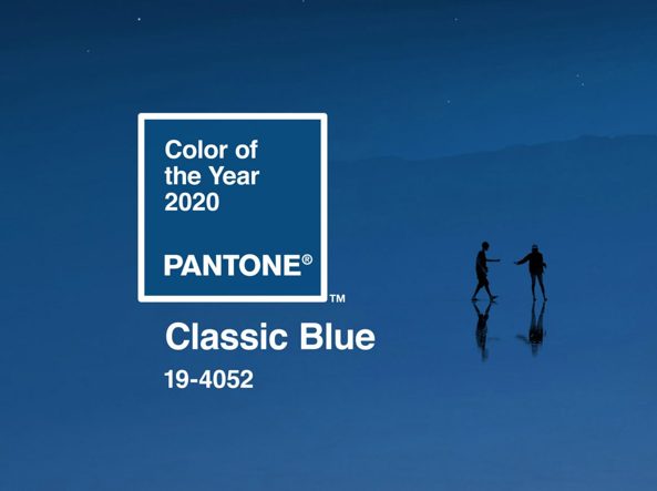
The color Pantone 2020 has just been announced, like every year! Surprisingly, we dive into the deep blue sea to find out more on Classic Blue! The “must have” color for the upcoming year, we will go with the flow on the footsteps of this cold color in search of joy (code 19-4052 PANTONE) that will guide our creativity through the inspiration of a sky at dusk, a tailored suit, serene waters, a bowl of ripe blueberries at the right point .

Farewell to the optimism of Living Coral replaced by the Blue which “brings a sense of peace and tranquility to the human spirit, offering refuge“
The US company, which developed the color classification that has become one of the best known, important and internationally followed-up, entrusts us with the intense blue tone that is “comforting and recognizable” at the same time.
The company references a “timeless blue, elegant in its simplicity“, a “reassuring” color, reminiscent of the sunset sky and “offers the promise of protecting you, highlighting our desire to have a solid foundation to build up our support”
” A boundless blue evocative of the vast and infinite evening sky, Pantone 19-4052 Classic Blue, encourages us to look beyond the obvious to expand our thinking, challenging ourselves to think more deeply, increase our perspective and open the flow of communication “
Leatrice Eiseman, executive director of the Pantone Color Institute
“A choice that summarizes thus: We are living in a time that requires trust and faith. It is this kind of constancy and confidence that is expressed by Pantone 19-4052 Classic Blue, a solid and reliable blue shade on which we can always count “.
“A global team of color experts scours the world in search of new color trends. Laurie Pressman goes on explaining: this may include the entertainment sector and films in production, traveling art collections and new artists, fashion, all areas of design, popular travel destinations, as well as new styles of life, styles of play and socio-economic conditions. Influences can also come from new technologies, materials, textures and effects that influence color, relevant social media platforms and even upcoming sporting events that capture global attention. “
Listone Giordano has chosen to associate this chromatic note of strong emotional impact with two parquet collections featuring a warm soul such as Perigal – in collaboration with Paola Lenti – and the historical Medoc signed by the master Michele De Lucchi, which links man to nature, to his deepest ego, and above all opens a glimmer of hope: “timeless and timeless shade of blue. Elegant settings in its simplicity.
The reassuring qualities of this stimulating color highlight our desire for a stable base from which to start while we are preparing to cross the threshold of a new era “.
Blue Symbology in nature: harmony and balance, as well as calm, blue identifies the faculty of relaxing bringing balance to the emotional sphere, and transmits a certain sensitivity, leading the individual to be more vulnerable to external “attacks”.
This color has the ability to normalize heart rate and pressure. It has the tendency, therefore, to make the body relax and to remove the sense of anxiety. It is also suitable for different meditation exercises. An environment tinged in a shade of blue can, in fact, help finding balance.
Those who favor this particular color are profoundly sensitive individuals in touch with their feelings, calm and with a strong ability to find one’s inner balance. The outline of a person who makes ideals his winning weapon and finds stability thanks to his attachment to traditions.
This is why the one who love this color might be considered unwilling to change. On the contrary, the person of Blu tends to follow the on-going ups and downs of life. Generally, the person who loves Blue tries to avoid chaotic environments and angry people.
The person who rejects this color is usually anxious and feels that his qualities are not appreciated. It avoids all the situations that make his life unrewarding. Not only. Reject all the environments in which you don’t feel in harmony. It tends to get depressed if all that surrounds it is not suited to its way of seeing and the lifestyle that it has imagined for itself.