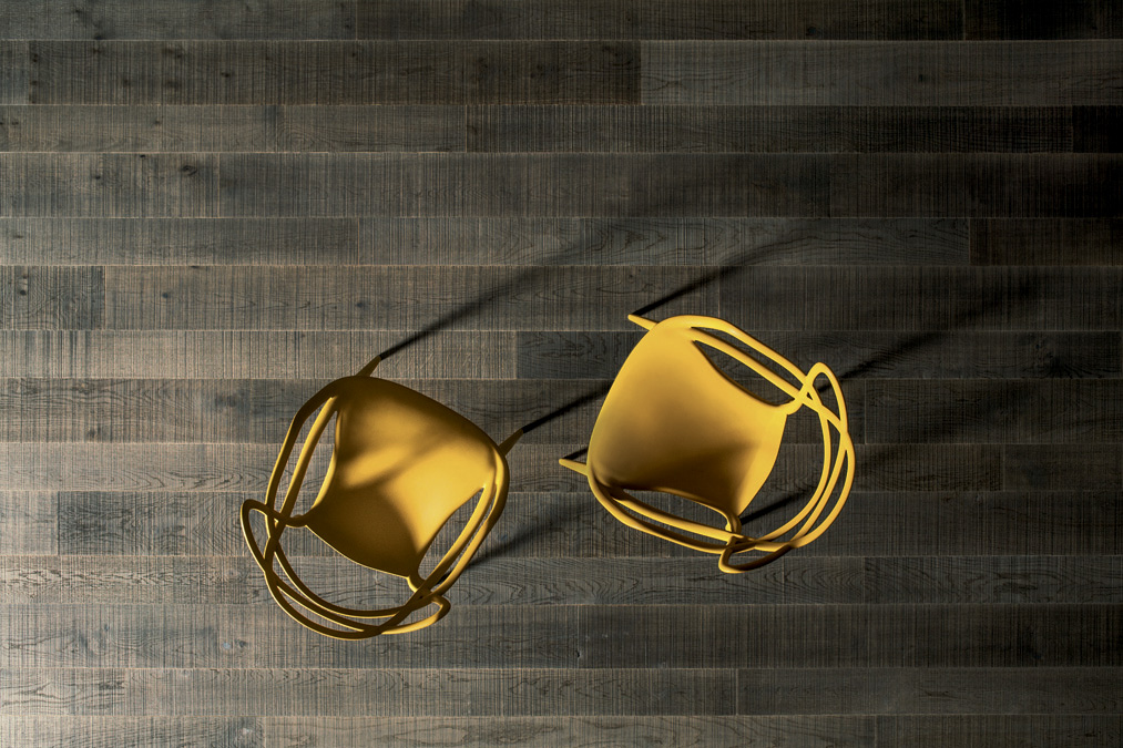
We welcome the new pantone color for 2021; design passionates gather around to cheer up as Pantone has unveiled the new shade for the upcoming months!
The long awaited news brings to the surface not one but two bright new shades: Ultimate Gray and Illuminating Yellow claim the “coveted honor”.
Pantone is committed to imagine the future as we move into this uncertain time; for the very first time in history, a Gray tone has been offcially selected as Color of the Year.

The gray and yellow hues are two strong and independent colors that “each stand-alone beautifully and when paired, conjure an image of optimism and strength, evoking a mood that’s both uplifting and energizing, while feeling grounded and subdued” Pantone stated.
Ultimate Gray is a soothing shade reminiscent of solid concrete foundations and ancient pebbled roads —Illuminating yellow evokes the power of light and warm sunshine: the ultimate goal in electing the color of the year remains the same as it reflects the “sign of the times”.
The selection of these contrasting (the dark and light side of the moon) colors highlight how different elements come together to convey a sense of strength and hopefulness that is both enduring and uplifting, the idea that it’s not about one color or one person, it’s about “union” and “solidarity”. The ability of applying the sober characteristics of Ultimate Gray combined with the vibrant Illuminating Yellow helps customising a home-interior project expressing a “message of positivity supported by fortitude,” said Leatrice Eiseman, executive director of the Pantone Color Institute. “Practical and rock-solid but at the same time warming and optimistic, this is a color combination that gives us resilience and hope. We need to feel encouraged and uplifted, this is essential to the human spirit.”
The marriage of these two colors evokes positive values following a markedly challenging year. In architecture, this palette is both playful and rigorous, it’s an open invitation to be used in social, domestic, commercial, care spaces, and more to communicate similar themes of resilience and human endurance.
There is no need to turn to a paint brush for a total gray or yellow look, it’s enough to add a splash of colour to your interior playing with details and accessories like chairs, pillows, vases, glassware and art pieces to get the perfect match.
READ ALSO – The light of Andalusia breathes new life in a historic apartment in Sevilla
What colour are you? Whichever it is, there is a floor that has your same vibe. Is it pure elegance or modernity you want? Or maybe that which attracts you is italian design to imbue the surrounding space with the spirit of our times. Three different lines of products attuned with different lifestyles allow for experimenting with shades and finishes: ranging from the sophisticated Atelier, Heritage collection with its predominant grey tones and rough surfaces to the outrageous Perigal Olio by Paola Lenti (gold/yellow liquid) wall and floor covering system blending geometry and nature, innovation and tradition!
The beauty of wood never pales, it goes far beyond simple trends, blending seamlessly into any interior design. It’s a floor surface that offers the warm embrace of nature, yet with a spirit that is always fresh and modern. A world of freedom that is almost without limits, open to personal interpretations. It really is impossible not to find your floor within this collection.
READ ALSO – Natural Genius: a ten year long journey investigates the industrial design applied to wood surfaces
Wood has always loved color. Not only because it has historically been the support for the oil paintings of the greatest maestros. Wood has also always been the one and most faithful material in cabinetry. And the same is true of parquet. The wood is treated to provide it with the best protection, but as they perform this basic role, finishes can also play a part in bringing out the best in natural wood. Or even enhance it with further chromatic features.
The treatments that are still today most commonly used have their origins in the history and expertise of the artisans of the past.
Pigmentation to add colour has always been a major factor in the ateliers of master cabinetmakers and instrument makers. Just like staining through priming or alkaline baths that interact with the tannins and other natural wood extracts. Both are techniques that have changed over the ages, and which now allow us to reach an incredibly varied range of different looks that span from bleached to pickled, from greys to shades of brown and even more intense dark colours.
Most of these are superficial applications. Thermal applications have a long and very Italian history that dates to the XV century. Pigments, staining and thermal treatments of wood are just the perfect “paint brush” to custom your interior design surfaces.
SOURCE: Courtesy of Pantone.
Listone Giordano GUIDE to choose wood flooring